Thursday, April 26, 2007

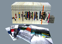
Richard Meier shows his collection of models


Architectural models are often shoved into back rooms or even relegated to the scrap heap, given that architects don’t necessarily want to show off their rough drafts.

But, like outtakes from a classic film or early versions of a great novel, the models can be more interesting to students and architecture fans than the final product, since they offer a window onto the creative process. In an age of computer renderings, they also give a vivid sense of how a building looks and feels.

So at age 72, the architect Richard Meier has decided to invite the outside world in, giving visitors a chance to sample an array of models from projects spanning his 40-year career. Stored in a bare-bones 3,600-square-foot studio in Long Island City, Queens, the collection ranges from Mr. Meier’s residential houses of the 1960’s to early versions of his J. Paul Getty Museum in Los Angeles in 1997.


It’s not an elegant space: the lighting is not particularly striking, and the floor is scratched from moving the models this way and that. But Mr. Meier is eager to welcome visitors.

“I realized I should really have people in because it just sits here,” the architect said in a recent interview at the studio. “To have all this and have no one see it is kind of crazy.”

The space, which can be seen by appointment only on Fridays, by no means contains the entirety of Mr. Meier’s work; much of it is still kept at his 10th Avenue office in the West 30s in Manhattan. But there is a substantial sampling — about 300 models. “You see I don’t throw a lot away,” he said.

While Mr. Meier has gained broad attention for projects like the 2003 Jubilee Church on the outskirts of Rome, with its soaring white concrete sails, or his recent boxy glass condominiums along the Hudson River in Manhattan, he is perhaps most closely associated with his sprawling hilltop complex for the Getty in the Santa Monica Mountains.

And it is the Getty that dominates Mr. Meier’s Long Island City studio. Until 1996, the models were kept in Los Angeles, but when the museum needed the space, Mr. Meier had them shipped to a warehouse in Queens. “I didn’t want them to get destroyed,” he said. “There is too much work here to discard them.”

The Getty remains perhaps Mr. Meier’s most ambitious project, with six separate buildings, plazas, an underground parking garage and a tram station on a challengingly steep 110-acre site. Landscaped gardens integrate the structures into the topography.

Immense models of the Getty are on view at the studio — the largest is 18 feet long and 11 feet wide, on wheels and with detachable pieces. “You can get into it more by being able to pull it away and really see into the spaces,” Mr. Meier said. “We had to take the skylight out to get it in here.”

Mounted on the wall is another large model that reflects how the structures were organized along a natural ridge in the hilltop. “You can see the way in which we cut into the earth, as well as building on top of the earth,” Mr. Meier said.

Perhaps most striking is a large-scale gallery mock-up that Mr. Meier had constructed so that people could step inside to experience it — how the sun slanted through the skylight, for example, and whether that natural light landed softly enough on reproduced paintings from the Getty’s collection, pinned to the walls. “We would wheel this into the parking lot and sit in it with curators,” Mr. Meier said.

Over all, the project took 13 years to complete, from 1984 to 1997. When the Getty Center finally opened, Herbert Muschamp, writing in The New York Times, called it “a stupendous new castle of classical beauty.” Some 30,000 people normally visit each week.

Smaller Meier study models focus on specific aspects of the Getty — different versions of skylights, trellises, land contours. You can see how he experimented with the Getty’s auditorium, playing with the seating arrangements and the shape of the ceiling. Shelves hold miniature versions of Mr. Meier’s boxy, modern furniture designs for the Getty — single chairs, double chairs, triple benches.

Among the other buildings represented are Mr. Meier’s first model of the Smith House (1967), a Connecticut residence overlooking Long Island Sound whose private areas are organized on three levels behind an opaque facade with windows. His Hoffman House in East Hampton, N.Y., completed the same year, is a three-dimensional abstraction of interlocking geometries.

And there is his Royal Dutch Paper Mills headquarters in Hilversum, the Netherlands, from 1992, featuring an interior street illuminated by natural light that enters through each side of a winglike roof.

There are also the projects that never got built. Mr. Meier offers glimpses of a 1981 headquarters for Renault outside Paris, and a “Memorial Square” he designed for the former World Trade Center site in Manhattan in collaboration with Eisenman Architects, Gwathmey Siegel & Associates and Steven Holl Architects. Mr. Meier said he was still fond of the design for the square, defined on the east and north with geometric gridlike buildings made of glass, and referred to it as “a lost opportunity.”

On the studio floor are Mr. Meier’s quirky, hulking sculptures, fashioned from the detritus of various architecture projects. Assemble the castoffs, Mr. Meier said, and “it becomes something else.”

But he hasn’t been making them lately. “I have no more room,” he said.

Serpentine Unveils Thorsen and Eliasson Design


By Lucy Bullivant on Architectural Record

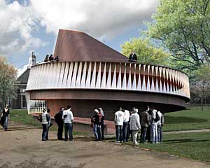
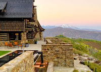
Final designs for the Serpentine Gallery’s annual summertime pavilion were unveiled in London yesterday. After a last-minute decision to postpone the German architect Frei Otto’s scheme (ArchRecord.com, March 23, 2007), the gallery gave Norwegian architect Kjetil Thorsen, co-founder of Snøhetta, and the Danish-Icelandic artist Olafur Eliasson a joint creative role. The duo created a top-like, spinning form clad in plywood with a steel structure flanked by a double-layer curved skin of teeth-like white baffles.
At a press conference on Wednesday, Eliasson said that their design takes its cue from “the dynamics of movement, exploring vertical circulation in a single space.” He added that it is intended “not to be about decoration but the interaction of people as they journey through the space.”

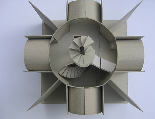
Visitors will enter the 50-foot-high pavilion via a spiralling helical ramp. On its ascent, the ramp curves upward into the outer wall in one form, taking visitors to the roof; there, an oculus will let daylight into the interior and provide a bird’s eye view of the space below as well as panoramic views of a park that surrounds the gallery. The upper roof cantilevers over an interior void.
“The program is now in its eighth year and we’ve been looking at how we can develop the project so it stays fresh,” said Julia Peyton-Jones, the Serpentine’s director, explaining the gallery’s decision to give Eliasson a substantial design role with Thorsen. Since the 1990s, she added, his work has “explored a new dynamic of what architecture could be.”

For his part, Eliasson said that he would conduct experiments with people inside the pavilion. These might include adding vibrational qualities to the building that would make it resonate like a musical instrument, and experiments with food and light. His Berlin-based studio researches the relationship between people and their surroundings and the impact of light conditions that the pavilion aims to reflect.

The Serpentine’s temporary summertime pavilion, which opens in July, attracts an average of 250,000 visitors. In the past it has featured designs by Rem Koolhaas, Alvaro Siza and Eduardo Souto de Moura, Oscar Niemeyer, Toyo Ito, Daniel Libeskind, and Zaha Hadid. As it has before, Arup will engineer the pavilion.
Type the rest of your post here.

AIA COTE Announces 2007 Top Ten Green Projects

Projects showcase excellence in sustainable design principles and reduced energy consumption

Washington, D.C., April 23, 2007 — The American Institute of Architects (AIA) and its Committee on the Environment (COTE) have selected the top ten examples of sustainable architecture and green design solutions that protect and enhance the environment. The projects will be honored on May 3rd at the AIA 2007 National Convention and Design Exposition in San Antonio.

The project descriptions highlight both the design innovations and sustainable strategies, along with the metrics achieved in terms of reduced carbon emissions, reduced energy consumption and improved building functionality.

The 2007 COTE Top Ten Green Projects program celebrates projects that are the result of a thoroughly integrated approach to architecture, natural systems, and technology They make a positive contribution to their communities, improve comfort for building occupants, and reduce environmental impacts through strategies such as reuse of existing structures, connection to transit systems, low-impact and regenerative site development, energy and water conservation, use of sustainable or renewable construction materials, and design that improves indoor air quality.

The jury included: David Brems, FAIA, Gillies Stransky Brems Smith PC; Alisdair McGregor, PE, Arup; John Quale, LEED AP, University of Virginia School of Architecture; Traci Rose Rider, LEED AP North Carolina State University; Anne Schopf, AIA, Mahlum Architects; and Susan Szenasy, editor-in-chief, Metropolis.

“Both the number of submissions and level of sophistication have increased dramatically since the AIA COTE Top Ten Green Projects program’s inception in 1997. This program examines a metrics that address context, transportation, energy, water, light and air, and other characteristics,” said Kira Gould, Assoc. AIA, chair of the AIA Committee on the Environment. “We are pleased to see design teams getting increasingly comfortable with such metrics, which suggests that performance standards are being effectively integrated into the design intent, rather than being understood as something separate.”


The 2007 Top Ten Green Projects (listed in alphabetical order):

EpiCenter, Artists for Humanity / Boston, MA
Arrowstreet Inc.
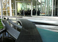
The first Platinum LEED Certified building in Boston, the EpiCenter is a simple, functional building that achieves the highest levels of sustainability on a tight budget. Rainwater collected from the roof is channeled through a transparent drain pipe which runs through the gallery into a holding tank to serve the irrigation needs of the grassy recessed courtyard. Concentrated windows on the south side of the building provides for the deep penetration of warming sunlight in the winter. Large floor-to-floor heights, 12 and 18 feet, allow daylight to penetrate deep into the building. The building uses no refrigerant-based cooling.

Juror Traci Rider said, “This project is not just about design and environmental sustainability, but reaching cultural sustainability. They had a low budget, and there is something terrific about what they achieved. This infill project has this elegant photovoltaic roof, and it’s really producing for them.”

Global Ecology Research Center / Stanford, CA
EHDD Architects
Global Ecology Research Center at Stanford University is a 10,800 square-foot, low-energy laboratory and office building for the Carnegie Institution of Washington. The unique sustainable design resulted in a 72% reduction in carbon emissions associated with building operation and a 50% reduction in embodied carbon for building materials. Biodiversity is addressed through a thorough pursuit of salvaged, recycled, and certified materials. The building facing directly to the south and north maximizes daylighting, sunshading, and ventilation opportunities.

Juror John Quale said, “LEED ratings were helpful for some of our considerations, but that played out in different ways. In this project, they intentionally opted out of the LEED process to push their own agenda. We appreciated the independent thinking and the explanation about it.”

Government Canyon Visitor Center / Helotes, TX
Lake/Flato Architects
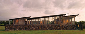
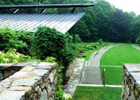
Key goals included designing spaces that respond to climate and demonstrate both active and passive green solutions. The structures have operable windows, generous open porches and a screened exhibit building oriented toward the prevailing summer breeze, while shielding the cold winter winds. Large overhanging roofs, flaps, and deep porches shield these spaces from direct solar gains, while allowing daylight to penetrate deep into the interior. The narrow footprint allows for maximum use of indirect daylight from both the south and the north in all occupied spaces, resulting in 90% of occupied space with effective daylight and views with 100% of spaces with ventilation controllability.

Juror Susan Szenasy said, “The building opens up and shades itself and fits into the landscape in an unaggressive way. There is also something really familiar and comfortable about it. The composition is very carefully controlled, from the site plan to details.”

Hawaii Gateway Energy Center / Kailua-Kona, HI
Ferraro Choi and Associates
The Hawaii Gateway Energy Center is an excellent example of the integration of passive design strategies to conserve natural resources and achieve exceptional building performance. Passive design strategies such as induced stack ventilation, daylighting, shading, and renewable cooling from deep seawater reduce initial energy requirements to an absolute minimum. A copper roof acts as the "engine" that triggers a thermo-syphon, radiating heat from the sun into a ceiling plenum. The heated air begins to rise and is exhausted through "chimneys" on the building's north face. This hot, exhausting stream of air is continuously replenished with 100% fresh outside air that is routed across occupied space from a vented under-floor plenum.

Rider added, “We were impressed by the way they blended active and passive technologies. This project uses PV and calls attention to that, and uses seawater and condensation. It’s really using all of earth’s devices, then dramatizing that with this visible structure. This is a great advertisement for a new technology - calling attention to an ancient ‘technology,’ the sun.”

Heifer International / Little Rock, AR
Polk Stanley Rowland Curzon Porter Architects, Ltd.
The fundamental goal of the design team was to create integrated building systems that maximized both energy savings and educational potential. Gray water collected from sinks and drinking fountains, condensate from outside air units, and rain water from the water tower are reused in toilets and cooling tower. The building is designed to use up to 54.9% less energy than a conventional office building. 75% of the building’s construction waste was recycled. Significant overhangs with crown like perforated metal edges reduce solar heat gain. To promote indoor air quality, materials were selected with low emission of volatile organic compounds (VOCs).

Juror Alisdair McGregor said, “This deals with water in a very demonstrable way. It takes condensation, stores it, and uses that for cooling towers and wetlands during dry periods. Energy performance is about 54% below ASHRAE 99. The sustainable features are visible, but not in your face.”

Sidwell Friends Middle School / Washington, DC
Kieran Timberlake Associates
Solar chimneys with south-facing glass are designed for passive ventilation, operating without additional energy. Sunlight heats air within the glass chimney tops, creating a convection current which draws cooler air into the building through north facing open windows. The building uses natural daylight in lieu of artificial light as much as possible. Artificial lighting consists primarily of fluorescent light sources equipped with high efficiency lamps. The green roof functions to reduce storm water runoff volume, improve the quality of infiltrated runoff, and reduce municipal water use. The roof, walls, and windows perform over 200% better than the minimums set by the energy standard.

Szenasy commented, “The building itself is a teacher. It tells the students where they are. It helps them be conscious of the water and light. There are all these cues connecting them to the natural world. This project is really comprehensive. They have a great attitude about water. They were very careful with light. It is beautiful. It is a really aggressive kind of renovation.”

Wayne L. Morse U.S. Courthouse / Eugene, OR
Morphosis & DLR Group
This facility is a Security Level IV facility – one level below buildings such as the Pentagon. An under floor air distribution system serves a majority of spaces, including the six courtrooms. This system provides more efficient air-conditioning, uses less fan power, and provides better air quality than a traditional overhead ductwork system. The building system minimizes potable water use and associated sanitary waste with water-saving fixtures including waterless urinals, and ultra low flow lavatories, sinks and showers. Combined with fixture sensors at public locations, these measures result in savings of more than 40% over baseline case analysis.
Juror Anne Schopf said, “The security issues are such a big challenge in a building like this, and getting the daylight in while dealing with those issues is a very smart response in a complex building type. They made a big move, getting the courtrooms raised up to the light. That’s the big story here. This addressed the issue that there are some federal requirements that work directly against sustainability goals.”

Whitney Water Purification Facility / New Haven, CT
Steven Holl Architects
The new facility provides an abundant water supply to south Central Connecticut, creates a vibrant watershed ecosystem, and includes a public park and educational facility while providing a diverse habitat and sanctuary for migrating species of birds. The 30,000 square foot green roof with glazed bubbles floods the facilities below with daylight. All electrical lighting comes from low-energy fluorescent fixtures. 100 % of staff space is day lit. The geothermal system saves 850,000 kilowatt hours annually as compared to electrical resistant heaters and air cooled chillers.

Juror David Brems remarked, “They reinvented the building type along with the programmatic understanding of a water purification facility by combining it with a park, putting some thing under ground, and being really inventive with form-making.”

Willingboro Master Plan & Public Library / Willingboro, NJ
Croxton Collaborative Architects, PC
The Public Library conserves 100% of the structural steel frame and concrete foundations of the original building. Since the building orientation could not be changed, seven major clearstory skylights were oriented on a true north-south axis to maximize the duration and traverse of daylighting. These true north/south clerestories for daylighting create a criss-cross infill of existing beams and joists which achieve 95% diffuse light with transitory “dappled light” effects. The building utilizes a gas-fired heater/chiller which can be easily retrofitted to accommodate bio fuels and various fuels presenting "cost opportunities".

Schopf added, “It was a shopping mall that had gone defunct. The master plan kept many of the existing structures in place, renovating and transforming them. This is a tremendous example of how to make something beautiful and functional out of practically nothing … the original Woolworth structure with a new wrapper. This is so relevant to so much of the existing building stock that exists in this country. Addressing these neglected facilities in this way is complex. This project really transformed place in a holistic way.”

Z6 House / Santa Monica, CA
LivingHomes, Ray Kappe
The Z6 House is a single family residence that was added to a multi-family zoned lot with an existing duplex. The building takes advantage of natural ventilation and has been designed to optimize passive solar heating. The heating is accomplished through a radiant heating system that is powered by a solar hot water collector. There is a 2.4KW PV array above the roof. This array acts as a shade canopy at the roof stair access. The PV array was designed to provide 60-75% of the homes energy usage. The building has a comprehensive environmental monitoring system that will track the total water, gray water and rain water usage.

Quale said, “Spatially this is a sophisticated project. There is a subtlety to the spacemaking. Also, there are a lot of prefab projects out there that have very little rigor to the sustainability, and this challenges that.”

Honorable Mention 2007 Top Ten Green Projects:

William J. Clinton Presidential Center / Little Rock, AR
Polshek Partnership Architects
Example of reclaiming a contaminated Brownfield, and a catalyst for area improvement.

Gerding Theater at the Armory / Portland, OR
GBD Architects Inc.
Project establishes connection between historic preservation and sustainability.

Provincetown Art Association and Museum / Provincetown, MA
Machado and Silvetti Associates
Modern take on traditional regional design, with beautifully integrated into existing context.

Stillwell Avenue Terminal Train Shed / New York, NY
Kiss + Cathcart Architects
Highly visible use of photovoltaics in a public transportation project.

Jean Nouvel to Build Paris Symphony Hall

by Alex Ulam
The French architect's design for the state-of-the-art symphony hall is an "exercise in disharmony"

Paris is one of the world’s cultural capitals, but a key offering is missing from its menu: a state-of-the-art symphony hall. That’s about to change. Earlier this month Jean Nouvel was selected as the winner of an international competition to design the Philharmonie de Paris, a music complex that will be the future home of the Orchestre de Paris.

Slated to open in 2012, the new complex will be located in the Parc de la Villette. In addition to providing a contemporary performance space, the Philharmonie de Paris will be the city’s first full-fledged professional music facility with offices, a library, and space for exhibitions. At its heart is Nouvel’s 2,400-seat concert hall, whose design is an exercise in disharmony. Its aluminum-clad exterior resembles a mass of crumpled metal slabs, while its interior contains bulging, sinuous shapes. The hall features a “vineyard-style” seating arrangement similar to that of Walt Disney Hall, in Los Angeles, where the audience is arrayed on raised terraces surrounding an orchestra platform.

Nouvel’s design was selected from a field of six finalists that included Francis Soler, Christian de Portzamparc, Zaha Hadid, Coop Himme(l)bau, and MRDV. The first phase of the competition drew 98 entries. Interestingly, architects who submitted designs were precluded from participating in the city’s other major architectural competition to design a two-acre superstructure that will be located at the entrance to the enormous underground Les Halles mall and transit center.

“Many of the international architects who wanted to be part of the Les Halles project, were chosen for the (Philharmonie de Paris) competition,” a spokesperson for Paris’s mayor explains. “Because the two of them are quite difficult projects, we had the idea that they wouldn’t have the time necessary to work on both of them at the same time.”

Provided by Architectural Record—The Resource for Architecture and Architects


Type the rest of your post here.

Monday, April 23, 2007

Calatrava’s Chicago Twisting tower-Spire got Approved

Chicago Spire
Chicago's great gamble in the sky is about to begin in earnest, and the odds are now better than even money that it will succeed as a work of skyline sculpture and as a building that engages the city around it.

After months of struggle, Zurich-based architect Santiago Calatrava finally has been able to make a winning match between visual poetry and the harsh realities of economics in his design for the twisting, 2,000-foot Chicago Spire, which would be the nation's tallest building.

Even if the design that the Chicago Plan Commission approved Thursday lacks some of the balletic elan of the original plan for this tower unveiled two years ago, it remains a powerful sculptural object with a strong structural rationale -- an innovative successor to such great Chicago skyscrapers as the twin corncobs of Bertrand Goldberg's Marina City.


But the 150-story tower is nonetheless a gamble, and not just for the developer, Dublin-based Garrett Kelleher, who insists this is no pie-in-the-sky skyscraper even if he refuses to reveal its cost or the price tag of its condos.

No one has ever built a twisting tower this tall, though a smaller version of this type is under construction in Dubai. For all the allure of Calatrava's architectural models, the Spire they show is as much an abstract sculpture as it is a real building. One wonders how the stunning geometry will look when everyday necessities -- windows, for instance -- intrude.

At best, this will be a new Eiffel Tower, a scale-shattering yet superb skyline statement that becomes the new postcard image of Chicago.

At worst, as less persuasive renderings of the tower suggest, it will be a visual cartoon, a supersize, superskinny version of a soft-serve ice cream cone.

Inevitably, some will lament that this is not the original version of the tower, called the Fordham Spire, which proposed a hotel and communications antenna as well as condos on a vacant site west of Lake Shore Drive and on the north bank of the Chicago River. But that design was a seductive fantasy. This one, which would house about 1,200 condominiums, is striving to be real.

Certainly, it has made great strides toward balancing form and finance, especially since December, when Calatrava made public a banal, nearly flat-topped version of the skyscraper. It instantly was tagged "Twizzler Tower" for resembling a piece of licorice.

Since then, the restless architect has moved gradually to the present plan, in which the tower rises energetically but nobly, making a 360-degree twist as it moves from the ground to a sharply articulated summit.

In January, he unveiled sketches to the Tribune that gave the tower a newly pointed top and promised a restoration of the tower's whirling upward drive. Then, accommodating complex structural requirements, he settled on the current design, which is somewhat bulkier than the pencil-like January version but remains attractively slender. Gone is another version, also revealed to community groups last month, that had too much twist in its top and revealed Calatrava's tendency to lapse into the visually hyperactive.

But the sky-high aesthetic risks haven't disappeared.


Materials make a difference

Calatrava needs to settle on materials -- he wants the exterior to include stainless steel, like the cladding of the much-admired Inland Steel Building of 1958 at 30 W. Monroe St. -- yet how they are detailed and manufactured is crucial.

The gap between vision and reality is already apparent in the glass exterior of the under-construction, 1,362-foot Trump International Hotel & Tower by the Chicago office of Skidmore, Owings & Merrill. Renderings by the architect showed an elegant glass skin, but parts of the exterior as built bring to mind distorted fun-house mirrors.

However the skyline drama turns out, the Spire has a greatly improved, ground-level design that belies the rap that Calatrava's skyscrapers are like ice sculptures, chilling the cities around them.


More-approachable approach

With Kelleher's encouragement, the architect has moved far beyond the original Fordham Spire plan, in which a ziggurat-shaped parking podium surrounded the tower's base and pretty much held the city at bay.

Instead, with Kelleher approving an expensive underground parking garage and asking the architect to plan the proposed 3.2-acre DuSable Park just to the east, Calatrava has given this enormous tower the fine-grained detail it needs to be a city-enlivening addition to both the riverfront and the lakefront.

The appealing features include a grand, circular plaza set between the tower and the north bank of the Chicago River. In addition, Calatrava's plans call for pedestrian passageways that will lead beneath the superstructure of Lake Shore Drive to the proposed DuSable Park, where Calatrava would handsomely sculpt the landscape. Undoubtedly Kelleher will market the tower as sitting in a 5-acre park, not the 2-acre building site. But the plans also promise to make this skyscraper much more than just an object to be ogled from afar.

True, traffic remains a concern, especially because tourists are sure to flock to this building. Signs will be needed to point those who come on wheels to nearby parking garages. Wisely, the tower's garage won't be open to the public, which should prevent a recurrence of the 1993 terrorist attack on the World Trade Center, when a bomb-laden van exploded in the center's underground parking garage, killing six people and injuring more than 1,000.

For all the questions looming around the Spire, however, this much is clear: The planned skyscraper has the aesthetic and urban design stature to match its projected height. Now the great drama begins: Will this thing actually get built? Will the reality match the promise?

Yes, Calatrava said Wednesday in an interview, explaining that the developer already is getting bids for caissons. His talents as a real estate oddsmaker, one hopes, are a match for his skills in shaping skyscrapers.

For more information about this project, please see website www.thechicagospire.com

Thursday, April 19, 2007

Architectural Record releases its Record Houses 2007 list

Architectural Record releases its Record Houses 2007 list.

Christ Church Tower - by Boyarsky Murphy (London)


Boyarsky/Murphy slips an 11-hour home into the tower of Christ Church in London

Brown House - by Randy Brown Architects (Omaha)

Randy Brown draws a line in the sand for Nebraska architecture with his family's Brown House, a labor of love in Omaha

VilLA NM - by UNStudio (New York)

Joining rectilinear forms with a twist, UNStudio’s VilLA NM, in upstate New York, captures the landscape in gold reflections

Ohana Guest House - by Cutler Anderson Architects (hawaii)

James Cutler crafts an ocean cottage, Ohana Guest House, for a windy and lush site at the end of the road on Hawaii’s Big Island

Casa Poli - by Pezo von Ellrichshausen Architects (Chile)

Atop a jagged cliff in coastal Chile, Pezo von Ellrichshausen sets Casa Poli, a great concrete cube, evoking a block of porous stone

Ring House - by Takei-Nabeshima-Architects (Omaha)

A country retreat outside Tokyo, TNA’s Ring House opens itself to vertical forest views through horizontal stripes

Loblolly House - by KieranTimberlake Associates (Maryland)

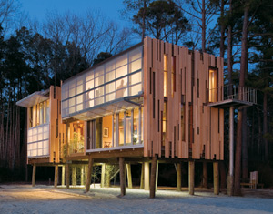
On a wooded site on Taylors Island, Maryland, KieranTimberlake tested a new way of building with the Loblolly house

Type the rest of your post here.

Monday, April 16, 2007

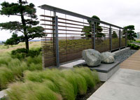
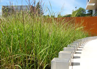
ASLA 2007 Landscape Award

The American Society of Landscape Architects (ASLA) has announced the recipients of its 2007 Professional Awards. The jury considered over 500 entries and selected 38 projects to receive awards. The awards will be presented on October 8 at the ASLA Annual Meeting in San Francisco at a ceremony and champagne reception sponsored by Landscape Forms.

General Design Category

Awards of Excellence

M. Victor and Frances Leventritt Garden at The Arnold Arboretum of Harvard University, Boston, Massachusetts
Reed Hilderbrand, Watertown, Massachusetts
client: Harvard University

Honor Awards

Curran House, San Francisco, California
Andrea Cochran Landscape Architecture, San Francisco, California
client: Tenderloin Neighborhood Development Corporation


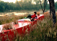
The Red Ribbon - Tanghe River Park, Qinhuangdao City, Hebei Province, China
Turenscape (Beijing Turen Design Institute) and Peking University Graduate School of Landscape Architecture, Beijing, China
client: Yang Lina, The Landscape Bureau, Quinjuangdao City, Hebei Province, China


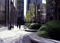
One North Wacker Drive, Chicago, Illinois
PWP Landscape Architecture, Berkeley, California
client: John Buck Company


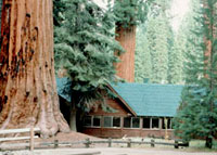
The Restoration of Giant Forest, Sequoia National Park, California
National Park Service, Lakewood, Colorado
client: Sequoia National Park


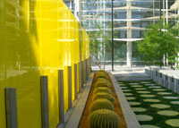
Mesa Arts Center, Mesa, Arizona
Martha Schwartz Partners, Cambridge, Massachusetts
client: Mesa Arts Center


Washington Mutual Center Roof Garden, Seattle, Washington
Phillips Farevaag Smallenberg, Vancouver British Columbia, Canada
client: Washington Mutual Bank, Kent Wiegel, Lane Premo


University of Minnesota Duluth - Swenson Science Building, Duluth, Minnesota
oslund.and.assoc., Minneapolis, Minnesota
client: University of Minnesota Duluth


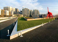
Olympic Sculpture Park, Seattle, Washington
Lead Designer: Weiss/Manfredi, New York, New York
Landscape Architect: Charles Anderson Landscape Architecture
client: Seattle Art Museum


Glacier Club, Durango, Colorado
Design Workshop, Denver, Colorado


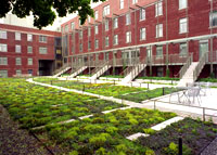
Harvard Graduate Student Housing at 29 Garden Street, Cambridge, Massachusetts
Richard Burck Associates, Inc., Jonathan Levi Architects with Bergmeyer Associates, Somerville, Massachusetts
client: Harvard University


NE Siskiyou Green Street, Portland, Oregon
Kevin Robert Perry, ASLA , Portland, Oregon
client: Sustainable Stormwater Management Program Oregon


Mount Tabor Middle School Rain Garden, Portland, Oregon
Kevin Robert Perry, ASLA, Portland, Oregon
Brandon Wilson, City of Portland Environmental Services
client: City of Portland, Sustainable Stormwater Management Program

Residential Design Category, co-sponsored by Garden Design Magazine

Award of Excellence


Elie Saab Residence, Faqra, Lebanon
Vladimir Djurovic Landscape Architecture, Broumana, Lebanon
client: Elie Saab

Honor Awards


Private Residence, San Francisco, California
Andrea Cochran Landscape Architecture, San Francisco, California


Erman Residence, San Francisco, California
Surfacedesign, Inc, San Francisco, California
James A. Lord, Roderick R. Wyllie, Moritz Moellers, Geoff di Girolamo
client: Mark Erman


Malinalco House, Malinalco, State of Mexico, Mexico
Mario Schjetnan/Grupo de Diseno Urbano, Mexico City, Mexico
client: Irma Romero


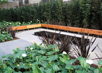
Manhattan Roof Terrace, New York, New York
Sawyer/Berson Architecture & Landscape Architecture, LLP, New York, New York


Farrar Pond Residence, Lincoln, Massachusetts
Mikyoung Kim Design, Brookline, Massachusetts
client: Bob Davoli & Eileen McDonagh


Pump House, Highland Park, Texas
MESA, Dallas, Texas
D.I.R.T. Studio, Charlottesville, Virginia


Sonoma Vineyard, Glen Ellen, California
MFLA Marta Fry Landscape Associates, San Francisco, California


Woody Creek Garden, Pitkin County, Colorado
Design Workshop, Aspen, Colorado


Connecticut Country House, Westport, Connecticut
Wesley Stout Associates, New Canaan, Connecticut


Lunada Bay Residence, Palos Verdes Peninsula, Southern California
Artecho Architecture and Landscape Architecture, Venice, California

Analysis and Planning Category

Award of Excellence


Hunters Point Waterfront Park Project, San Francisco, California
Hargreaves Associates, San Francisco, California
client: Arc Ecology

Honor Awards


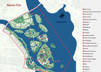
The Park and New Town upon the fishponds -
The Planning of 2007 China International Garden Show Park Area in Xiamen
, Xiamen, China
Atelier DYJG, Beijing, China


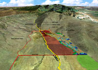
Wildhorse Ranch, Steens Mountain, Oregon
DHM Design, Denver, Colorado


Atlanta BeltLine Redevelopment Plan, Atlanta, Georgia
EDAW, INC., Atlanta, Georgia


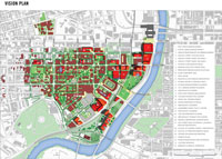
Penn Connects: A Vision for the Future, Philadelphia, Pennsylvania
Sasaki Associates, Inc., Watertown, Massachusetts
client: University of Pennsylvania


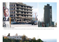
University of Balamand Campus Master Plan, Al Koura, Tripoli, Lebanon
Sasaki Associates, Inc., Watertown, Massachusetts
client: University of Balamand


Lower Howard's Creek Corridor Management Plan, Clark County, Kentucky
Parsons Brinckerhoff, Lexington, Kentucky, in conjunction with Ned Crankshaw, ASLA
client: Clark County Fiscal Court and The Friends of Lower Howard's Creek


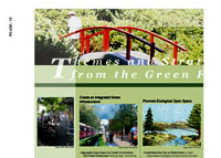
Open Space Seattle 2100 Envisioning Seattle's Green Infrastructure for the Next Century, Seattle, Washington
Department of Landscape Architecture, University of Washington, and the Open Space Seattle 2100 Coalition, Seattle, Washington

Research Category, co-sponsored by Council of Educators in Landscape Architecture (CELA) and Landscape Journal

Awards of Excellence

Defiant Gardens: Making Gardens in Wartime by Kenneth Helphand, FASLA
Trinity University Press, San Antonio, Texas
Department of Landscape Architecture, University of Oregon, Eugene, Oregon

Honor Award

The Green Build-out Model: Quantifying Stormwater Benefits of Trees and Greenroofs in Washington, DC
Casey Trees Endowment Fund, Washington, DC

Communications Category

Award of Excellence


TOPOS - The International Review of Landscape Architecture and Urban Design
Munich, Germany

Honor Awards

The Chicago Green Alley Handbook, Chicago, Illinois
Hitchcock Design Group, Chicago, Illinois
client: City of Chicago Department of Transportation

Cultural Landscapes as Classrooms Series
The Cultural Landscape Foundation, Washington, DC